


How to create themes in Typescript React application using Context API, React hooks, and CSS variables
In this article, I go back to the beginning of HelloJS, to the time when I recorded a video about themes in React application. One and a half years after this film was recorded, I still think that many of you might find it useful, so I decided to write an article about it.
Criteria
We are going to build a theme layer within the configuration of the theme colors, and functionality which let us change the theme from one to another.
Tools used in this example:
- React with Context API and hooks
- Typescript
- CSS variables
Example application
There you can get the repository
Idea explanation
Context definition and its scope
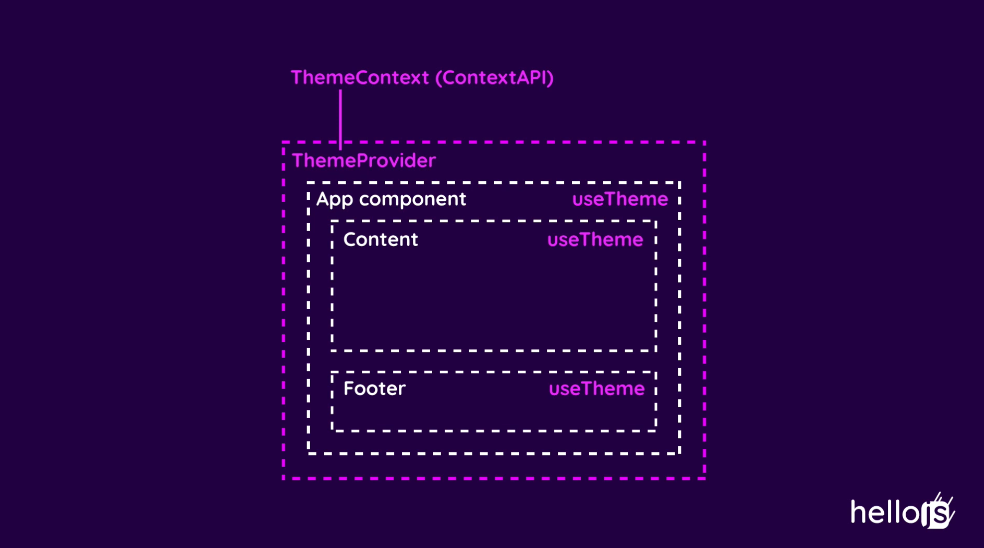
As you can see in the picture above, we want to define a ThemeContext and then wrap the whole app inside a ThemeContext.Provider.
Thanks to that we will be able to use our custom useTheme hook in every place in the App component structure.

Theme configuration
Another step is to create good typing and theme configuration.
Implementation
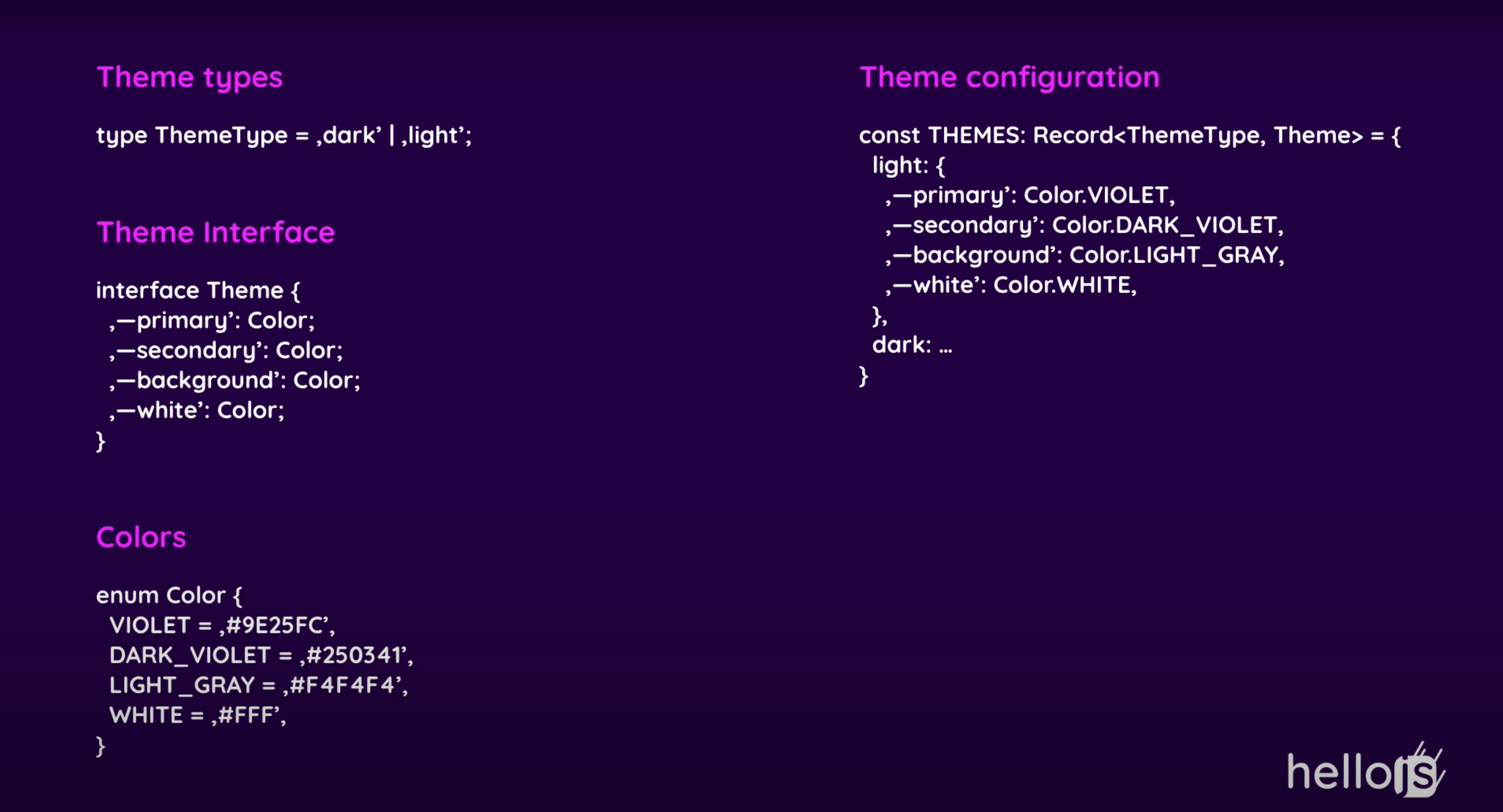
Types definition
First of all, let's define a Theme interface. My idea here is to define a Theme interface which has keys named in CSS variable naming convention. Color names are the same for all themes, but colors values are flexible depending on the current theme. Later you will see how I found it useful.
interface Theme {
  '--primary': Color;
  '--secondary': Color;
  '--background': Color;
}
Next, I created a Color enum which defines all colors used in the app.
enum Color {
  VIOLET = '#9E25FC',
  DARK_VIOLET = '#250341',
  LIGHT_GRAY = '#F4F4F4',
  WHITE = '#FFF',
}
We also need a ThemeType type to determine the selected theme.
type ThemeType = 'dark' | 'light';
In the end, we need a themes config describing all about the colors for each theme.
Themes config
const THEMES: Record<ThemeType, Theme> = {
  light: {
    '--primary': Color.VIOLET,
    '--secondary': Color.DARK_VIOLET,
    '--background': Color.LIGHT_GRAY,
  },
  dark: {
    '--primary': Color.VIOLET,
    '--secondary': Color.WHITE,
    '--background': Color.DARK_VIOLET,
  }
};
A theme config is an object with ThemeType keys and Theme objects as values.
Themes provider
import React, { Dispatch, SetStateAction } from 'react';
import { THEMES } from './Theme.config';
import { ThemeType, Theme } from './Theme.types';

interface ThemeContextProps {
  themeType: ThemeType;
  theme: Theme,
  setCurrentTheme: Dispatch<SetStateAction<ThemeType>> | null
}

export const ThemeContext = React.createContext<ThemeContextProps>({
  themeType: 'light',
  theme: THEMES['light'],
  setCurrentTheme: null
}

export const ThemeProvider: React.FC = ({ children }) => {
  const [currentTheme, setCurrentTheme] = React.useState<ThemeType>('light');

  return (
    <ThemeContext.Provider value={{
      themeType: currentTheme,
      theme: THEMES[currentTheme],
      setCurrentTheme,
    }}>
      {children}
    </ThemeContext.Provider>
  )
}

export const useTheme = () => React.useContext(ThemeContext);
The ThemeContext is a common react context implementation.
First I defined a context type ThemeContextProps, then I created context with an initial state
const ThemeContext = React.createContext<ThemeContextProps>({
  themeType: 'light',
  theme: THEMES['light'],
  setCurrentTheme: null
}
The next step is to create a ThemeProvider which takes children as an argument. It's important to be able to render react components inside ThemeProvider.
ThemeProvider manages currentTheme state. In the end, we return ThemeContext.Provider with value object. In this example, I passed themeType, theme, and setCurrentTheme.
- themeType - To be aware of which theme is the current one and be able to react to that information.
- theme - This is an object containing all of the current theme colors
- setCurrentTheme - The function for theme change
Wrapping application into the ThemeProvider
To have a possibility of using useTheme hook in the App component, I decided to wrap the whole react render in ThemeProvider
ReactDOM.render(
  <React.StrictMode>
    <ThemeProvider>
      <App />
    </ThemeProvider>
  </React.StrictMode>,
  document.getElementById('root')
);
Cool, that's all about implementation. Now we can use our theme.
Usage
To use the theme, we can simply get it from useTheme hook.
const { theme, themeType } = useTheme()
Now depends on themeType we can render a dedicated graphic or another part of the UI, like this:
const logo = themeType === 'light' ? darkLogo : lightLogo
Cherry on top
To use dynamic theme colors, we need to pass the theme object as CSS variables.
<div
  style={{
     ...theme
  } as React.CSSProperties}
>
  // content
</div>
What happened above is basically spreading the theme object in style attribute for a div. Now it's a good time to remind you how the theme object looks like. So theme object contains keys named in CSS variable naming convention, and the values are colors defined in Color enum.

Thanks to that, we passed CSS variables with these values, for example
'--primary': Color.VIOLET, // '#9E25FC'
Now we can use it in CSS files.
.example {
  color: var(--primary)
}
If you don't know CSS variables, I encourage you to read my article about introduction to CSS variables.
Colors scope
If we pass the theme as a value for the style attribute at the very top level of the app, we will have all of the colors accessible for the whole components tree.
And that's all, I hope you found it useful.
If you need more explanation, please check out my youtube video
