


Perhaps you struggle with the mobile browser bar covering your website/application content. It might be the case when you develop a popular part of the web application which is a sidebar.
I was in the same place a few days ago. I developed side navigation which takes the whole view height. Imagine this navigation with some content aligned to its bottom edge.
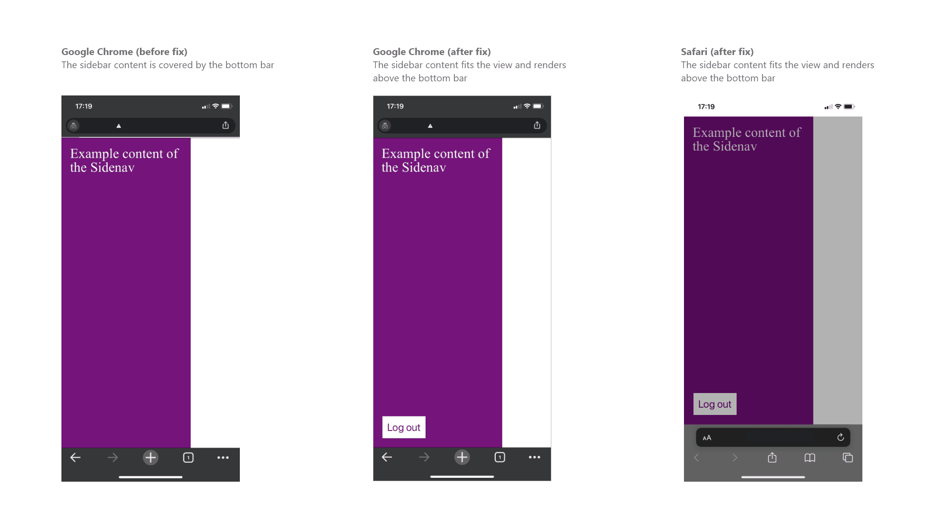
Everything was working great on the desktop, but when I opened the page on my mobile phone, the browser bottom bar covered some of the navigation content. It broke the functionality because the user couldn't click the critical button.
During looking for a solution I found some useful options.
Option 1. Keep the browser bottom bar always visible
There is a "trick" that makes the mobile browser bottom bar always visible. If this option fits your needs, you can try that.
As you can see it affects the whole html, so be careful and ensure that it works in your case.
html {
  overflow: hidden;
  width: 100%;
}

body {
  height: 100%;
  position: fixed;
  overflow-y: scroll;
}
As a result, you would always see the browser bottom bar, no matter if you're scrolling the page.
Option 2 - Consider if you need to use "100vh" as a height value.
Initially, I set the sidebar "height" as "100vh", and then I realized that it was the root cause of covering the content by the browser's bottom bar.
A simple switch to "100%" instead lets the content display above the bar.
Images
Example code
index.html
<!DOCTYPE html>
<html>
  <head>
    <title>Hellojs</title>
    <meta name="viewport" content="width=device-width, initial-scale=1">
    <link rel="stylesheet" href="reset.css">
    <link rel="stylesheet" href="styles.css">
  </head>
  <body>
    <div class="sidenav">
      <div class="sidenav__content">
        <p>Example content of the Sidenav</p>
        <button>Log out</button>
      </div>
    </div>
  </body>
</html>
styles.css
.sidenav {
  height: 100vh; // Change to 100% will display properly in mobile browser
}

.sidenav__content {
  background-color: purple;
  box-sizing: border-box;
  display: flex;
  flex-direction: column;
  height: 100%;
  justify-content: space-between;
  padding: 20px;
  width: 300px;
}

p {
  color: white;
  font-size: 2rem;
}

button {
  background: white;
  color: purple;
  font-size: 1.5rem;
  padding: 10px;
}
