


What is the aspect ratio?
An aspect ratio is a proportional relationship between an element's width and height, like 1:1, 16:9, 4:3, etc.
How to set an aspect ratio to the element using CSS?
Let's try to reach a 16:9 aspect ratio in CSS with two different methods. In both examples, I will render the container within three boxes. Each box will have a dynamic width value, defined as 25%. Our task is to set a 16:9 aspect ratio for each box. To make this example a little bit difficult and point out possible issues, we will render a paragraph in each box.

CSS basics definition:
.container {
  align-items: center;
  background-color: #EEE;
  box-sizing: border-box;
  display: flex;
  height: 500px;
  justify-content: space-between;
  padding: 100px;
  width: 100%;
}

.box {
  background-color: #9E25FC;
  width: 25%;
}
Old method - Top padding:
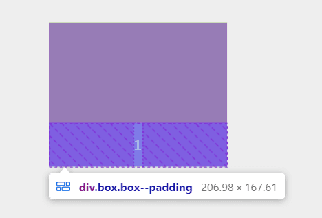
In this example, we want to achieve desired height using calculated top padding. To achieve the 16/9 aspect ratio we need to calculate the top padding value.
25 * 9 / 16 = 14.625
.box--padding {
  position: relative;
  padding-top: 14.625%; /* 16:9 Aspect Ratio */
}
This method has one issue - To position box content, we need to use position: absolute because the combination of top padding and the size of elements inside the box enlarges the whole box height.
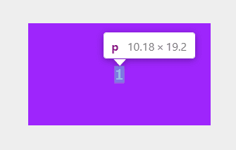
.box--padding p {
  position: absolute;
  top: 50%;
  left: 50%;
  transform: translate(-50%, -50%);
  margin: 0;
}
How to define a 16:9 aspect ratio using the CSS aspect-ratio property?
I hope you read a "top padding" example so that you know it's not a straightforward solution. Now I'll show you a better option with the aspect-ratio property. First, I will use the ".container" definition we already made. Second, I will create a new box class, which defines its aspect ratio in a very simple and readable way.
.box--aspectratio {
  align-items: center;
  aspect-ratio: 16 / 9;
  display: flex;
  justify-content: center;
}
That's it. To set the proper aspect ratio we simply use a single line of code - aspect-ratio: 16/9 . The rest is about adding a flexbox to center the content. We do not need additional paragraph styling with absolute positioning as we did for the first solution.
Aspect-ratio 1:1 - Height Equal to Width
To set aspect ratio using CSS aspect-ratio, you no longer calculate the top padding. All you need to do is set single property, like so:
aspect-ratio: 1 /* Aspect ratio 1:1 */
aspect-ratio support
I encourage you to check browser support before you use this property in your project. This is how the browser support looks like at the moment of creating this article.
- Google chrome v88 or highter,
- Firefox v89 or higher
- Edge v88 or higher
- Safari v15 or higher
- aspect-ratio is supported also on few mobile browsers.
- not supported on IE
